The target audience for Q magazine are the older generation such as people in their 20's and 30's who are looking for a different mode of address, more sophisticated and just want to know more about the music instead of what colour pants so and so is wearing.
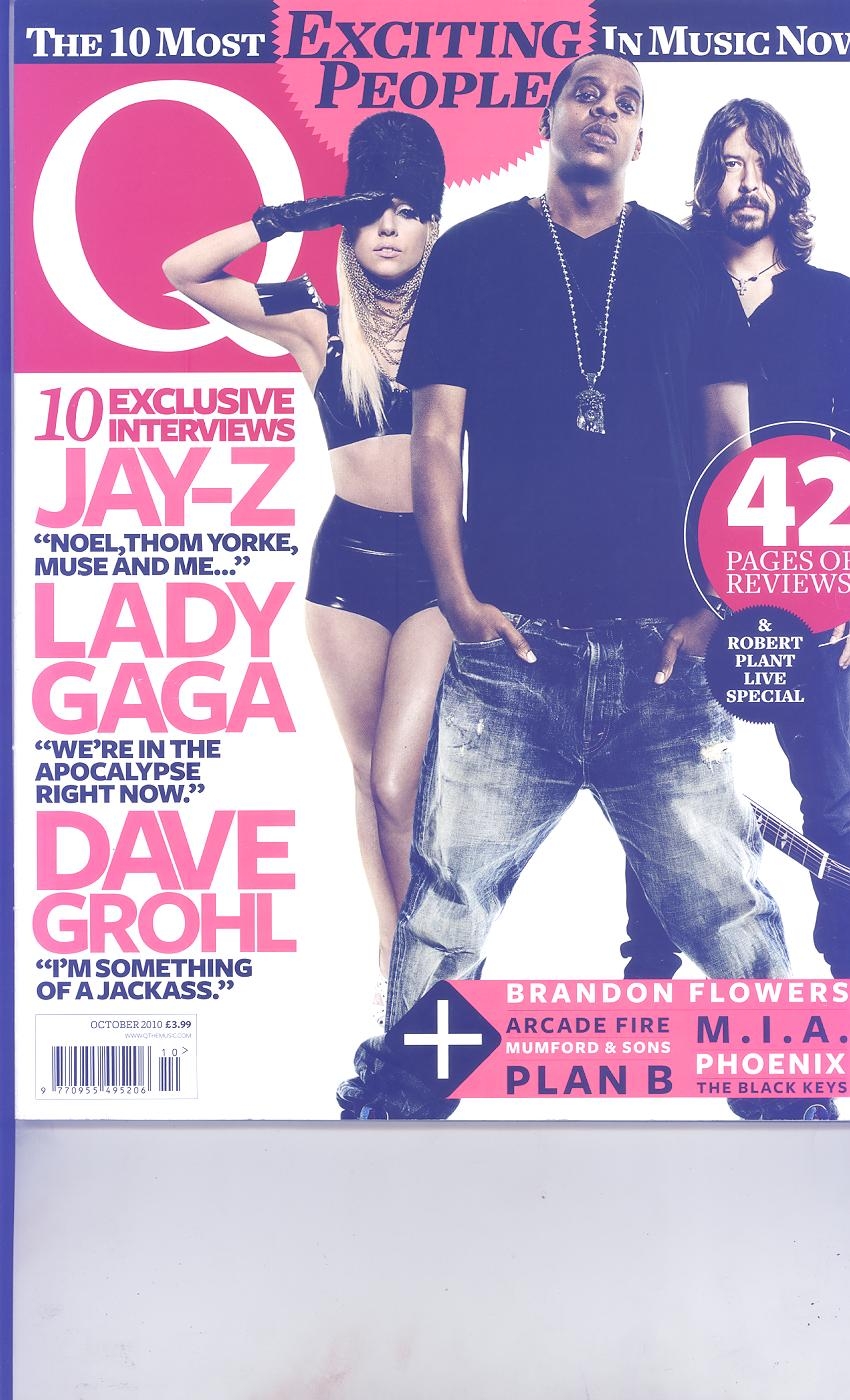
The tree music artist is looking directly at the camera standing up straight emphasizing their power and influence over music. Jay-Z being in front of both Lady Gaga and Dave Grohl enhances his supremacy and high self-esteem, as he is one of the most financially successful hip hop artists and entrepreneurs in America, it also indicates he will be the most talked about inside the article.
A Personal direct mode of address is shown, as the low angle shot was deliberately chosen so that the audience is looking up at them. They want a close relationship with the audience.
The text used on the side this article links to the cropped image used in the magazine. Each artist’s name is on the side to show that news about them will be mentioned in the article. ‘Exciting people’ referring to the main tree people on the front cover.
The overall message that this Q magazine is giving is that the style of music is more sophisticated and mature but it still has ‘swagger’. This magazine cover is informing the audience of ‘the ten most exciting people’ in music industry now, persuading them to continue to listen to the following artist’s music Lady Gaga, Jay-z and Dave Grohl.
The words ‘Exclusive’ and ‘exciting’ are written in bright bold capital letters to pull the audience’s attention, as it is in a different colour to the other words written on the front cover.
The title block is on a red background and the letter ‘Q’ is written in white so that it make it more appealing to the eye, it’s also very simple and sophisticated which links back to the classy target audience.
The neon coloured puffs are marginalized to make the main image stand out as it surrounds the cropped images. Puff links to the star above the main image saying ‘exciting people’ so that the audience know that the people in the main image are the ‘exciting people’, also it uses a low angle, and their posture is quite confident showing that they are important.

0 comments:
Post a Comment