Thursday, 25 November 2010
Draft of my own magazine: Front Cover, Contents page &Double page spread
Posted by Francia.Cabulo at 19:22 0 comments
Thursday, 18 November 2010
Some of the Photos 4 My magazine
Mid-Shot
Bird Eye view
Long Shot
Posted by Francia.Cabulo at 06:09 0 comments
Thursday, 11 November 2010
Sunday, 7 November 2010
Posted by Francia.Cabulo at 17:35 0 comments
The Original My Magazine MastHead
J.C Drives me was the chosen name chosen by the Participants (J.C stands 4 Jesus Christ) However i was considering in changing it to somthing else shorter.
(the first one is the one i will be using)
Posted by Francia.Cabulo at 12:36 0 comments
Friday, 22 October 2010
Title Block Analysis
Posted by Francia.Cabulo at 01:04 0 comments
Friday, 15 October 2010
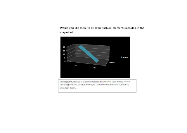
Questionnaire Results & Analysis
Posted by Francia.Cabulo at 03:46 0 comments
Thursday, 14 October 2010
'Kerrang' Double Page Analysis

Posted by Francia.Cabulo at 14:14 0 comments
Wednesday, 13 October 2010
‘Kerrang!’ Contents page analysis
Posted by Francia.Cabulo at 16:40 0 comments
'KERRANG!' MAGAZINE FRONT COVER ANALYSIS
Immediately the reader is able to identify that this is a rock music magazine due to the vague colours and the onomatopoeic Masthead of a guitar. having all five members of a rock band with pale faces, dark circles on their eyes and blood smudged all over them - on the front cover shows that this magazine is clearly targeting at a more immature teenage group, probably age 16+ who are interested in hard core noisy and violent sounds/lyrics.
Posted by Francia.Cabulo at 04:28 0 comments
Tuesday, 12 October 2010
'Q' MAGAZINE DOUBLE PAGE ANALYSIS
Posted by Francia.Cabulo at 07:03 0 comments
Thursday, 7 October 2010
The ‘Q’ Magazine analysis (content page)
The main colours used is red, black and white which is the main colours of the front cover
The main cover stories have a big image and a big number next to it so that it’s easier for the reader to access. The content page is laid out neatly so that it is simple to read. Most if the images are in the middle and the writing is surrounding the pictures. The bold headlines are written in capital letters to aid the reader of what topic is on what page.
Posted by Francia.Cabulo at 08:17 0 comments
The 'Q' Magazine analysis (front cover)
The tree music artist is looking directly at the camera standing up straight emphasizing their power and influence over music. Jay-Z being in front of both Lady Gaga and Dave Grohl enhances his supremacy and high self-esteem, as he is one of the most financially successful hip hop artists and entrepreneurs in America, it also indicates he will be the most talked about inside the article.
A Personal direct mode of address is shown, as the low angle shot was deliberately chosen so that the audience is looking up at them. They want a close relationship with the audience.
The neon coloured puffs are marginalized to make the main image stand out as it surrounds the cropped images. Puff links to the star above the main image saying ‘exciting people’ so that the audience know that the people in the main image are the ‘exciting people’, also it uses a low angle, and their posture is quite confident showing that they are important.
Posted by Francia.Cabulo at 08:17 0 comments
Magazine Questionnaire
1. Who is your favourite Gospel artist?
Posted by Francia.Cabulo at 08:12 0 comments
Planning Music Magazine
Posted by Francia.Cabulo at 08:06 0 comments
Wednesday, 29 September 2010
Magazine labelling

Posted by Francia.Cabulo at 02:33 0 comments
Tuesday, 28 September 2010
Preliminary task - Front cover and Contents page

Posted by Francia.Cabulo at 03:38 0 comments
Monday, 27 September 2010
Britney Spears - Rolling Stone cover Anaysis
The rolling magazine makes an intertexual reference with the teletubby company. The rolling magazines decide to make Britney hold the purple teletubby. But why the purple one? Through my own research I have found out that in previous years it was shown that the purple teletubby was being portrayed as being gay. To conclude I believe that it’s subliminally connoting that she is so sexy she can turn a gay reader straight or maybe giving the message that ‘it’s alright to be gay ‘ again showing the typical teenager rebelling against society’s norms .
The clear bold text is surrounding her ‘making her look important. ‘Inside the heart, mind and bedroom of a teen dream’ this is referring that the reader will have knowledge of her exterior as well as her interior self. It is also telling the reader that they can relate to her because she’s a teenager just like them
The hot silk pink cover reinforcing the girly and lusty atmosphere, her bra being the only fully black item makes her breast stand out.
second Cover
Spears is in a tight space (cubicle), her body is being used as a frame for the words of the magazine because the words are surrounding making her the centre of attention connoting the relationship between her and the viewer (close, tight relationship).
Third cover
The image has been framed tightly and closes so that the reader is not able to see the background/setting making her the main focus, the audience is able to look at her like a mirror image, this add to personal theme of the magazine cover.
Posted by Francia.Cabulo at 14:40 0 comments


