BLOGGER TEMPLATES AND Blogger Templates »

Tuesday, 17 May 2011

SurveyMonkey Results (Mock up)


Friday, 11 February 2011

Final Magazine Evaluation

During my Media A level Course I analysed several music magazine; front covers, content pages and double page spreads. I analysed the convention of a music magazine and examined them on how and why they were presented. Through the knowledge and understanding I gained I was able to collect enough basis to create my own music magazine. I used similar features from the Vibe magazine that I analysed. I included a mid shot as my central image in order to give a direct mode of address, followed by the anchorage text to draw the reader in and to give them a hint of what will be in the magazine. The use of no more than four colours used in a real music magazine is effective because it gives the magazine a theme which I also applied to my magazine. The three colours that I used (gray, yellow and blue) combined well together and it’s attractive to the viewers eyes. Having the masthead ‘J-STAR ’in a 3D effect dominating the font cover, not only makes it stand out from the rest of the other text used in the magazine to show that it’s the title it also represents the genre of the magazine but it also helps anyone identify the genre of the magazine. For example, from looking at ‘VIBE’ magazine: vibe is short for vibration, vibration from music - Hip-Hop and R&B tend to have a lot of base so you can immediately tell that it’s a R&B and Hip-Hop music magazine. The same can be said about my media product ‘J-STAR’ (Jesus star easy and memorable) The letter ‘J’ stands for Jesus, from reading the rest of the text on the front cover instantly the read will acknowledge that ‘J-STAR’ is a gospel magazine. Like most magazine I added buzz word like ‘exclusive’ which stands out to persuade the customers into buying this ‘exclusive’ magazine. As you can see I made sure that the same colours and fonts used on my front cover were use on my contents page in order to keep a fixed house style. The layout of the content page is simple and well structured: the contents page is made up of just three categories to keep it organised and easy to read, the centre image of the main host of the magazine. I chose to merge some images along with page numbers on the side like a colaj rather than following the usual convention where the image is put right next to the wordings. My style of presentation is unique and makes the contents page more intriguing to look at and it also brings out a modern atmosphere.


The image of teenagers is generally portrayed negatively by the media now-a-days; the most common stereotypes of teenagers (partially ethnic minority (if they wear a hoodie they will automatically be ladled as criminals) are that they are rebellious, drug abusers, promiscuous, alcoholics or usually participating in anti-social social behaviour. This is shown in many aspects by the media, whether it is on a soap teenage storyline or news headline. However my magazine shows a clear positive representation of the specific social group of black teenage girls. I use different methods to impose a positive image of black girls for example through my the double page spread I present my artist as a courageous and independent young woman; which is shown through the interview where she talks about the struggles she went faced before she became a gospel sing, she not only explains how she overcame them but she also gives a special advice of how the reader can overcome their problems to be successful – “it ‘s not about how much obstacle you face, it’s about the strength you have to overcome them”.- she encourages the reader. I did this so that the reader could have close relationship with the artist and look at her a role model.  My artists rebel against the stereotype of christens being boring and religious. Having her wear clothes that are in fashion makes her more modern and appealing to the target audience. I believe that my magazine challenges the negative stereotypes that the media labels young people today in society.  
The media institution company that I would like to distribute my magazine would be BBC Magazine company which is owned by the government (censorship) by all mean my magazine will have to meet the general guide lines of; educating, informing and entertaining which I believe my magazine has these qualities, the way that I represent my magazine shows that it has an inspiring and friendly brand image. The mainstream magazine published by the BBC Magazine Company is targeted at different social group – Adults, teen, Pre-teen and per school. BBC is popular through their TV and Radio channels targeting at both adults and children. BBC would be successful in distributing my magazine because my magazine will bring a wider range of different type of audiences.
My magazine is targeted at the mature teenage black girl aged 15 to 18, who are interested in gospel grime music. The reason as to why I chose this specific target audience is because nowadays we don’t see much teenage gospel magazines that appeal to them instead we see more Hip Hop, R&B, Rock etc. therefore I want to do something different and as a gospel listener, I know things that they like and I value their interest. The reason why I chose to have an ethic minority female in the font cover is because it will appeal to the target audience as they are an ethic minority so they will automatically assume that they can relate and will be keen to read the magazine.  I observed and took notes on this particular social group and I noticed that they have a typical teenage fashion sense which is the reason why the artist on my magazine is wearing a hoodie. However as I analysed my magazine I become aware of, that my magazine can draw in a secondary audience which are black boys who are interested I n gospel grime I would say this because gospel grime is a genre that a lot of black boys are starting to listen to now. Regarding my media product, my magazine doesn’t contain feminine colours, on the contents page I show that I interview a lot of male gospel grime artists which may additionally appeal my secondary audience.


During the process of constructing my media product I learnt a great deal about different technologies. In order to make my product I used various technology; first of all I used a computer/internet to create a blog so that I could save all my documents and research database (I was able update my progress, showing evidence of pictures). The internet allowed me to research on the conventions of magazines to help me with my own. I used a professional digital camera to take pictures for my magazine, the fact the camera that I used featured 18.9 megapixels it meant that the images were going to come out clear and professional. With the SLR digital camera I was able to learn different camera effect, more importantly I learnt how to use it. In the making of my media product I mainly used Adobe Photoshop and illustrator software, I was able to use different effects and edit a photo like the photo on the left (in Photoshop), for example, the first thing I did was to use smudge tool to smudge  off what I didn’t want to be seen (the number) the second step was to created another layer of the same image but this time I made the image black and white, I then carefully cropped out what I wanted in colour (the actual phone)which I then merged it the on top of the other  layer which then to made the phone stand out in colour. I really enjoyed making this image becaus experienced with other tools.                                                                                                Overall the different technology source that I have used helped me abundantly with the making of my front cover, double page spread and contents page in several ways. Without the technology it would have been much harder to keep track of what I was meant to be doing and also my work would have been less professional.


the same effect was used in this image 


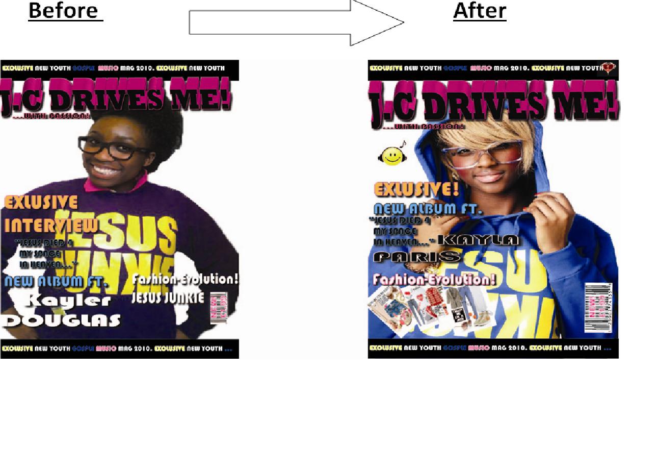
Looking back at my preliminary task that I had to complete at the beginning of this course; although it was a simple task of creating a college magazine using some of the basic tool in illustrator like the gradient and the type tool mainly (only took me two lesson to complete), I believe that it helped build my confident and made me feel comfortable in using the software. In my preliminary task I showed lack of knowledge of the conventions of a magazine. Looking at the choice of colours, I clearly didn’t show a house style which I believe that it wasn’t suitable for the reader because the colours are all over the place. The presentational is poor, no special effect or signs of any other tool used (magic wand tool) which made it look unprofessional.                                                                                        


However in my final music magazine was able to apply the magazine conventions such as having a house style as you can see the three main colours that I have used. Using the skills that I learnt in Photoshop and illustrator I was able to crop a mid shot image that I took and feather it, I was also able to use the font effect to make the text more intriguing e.g. drop shadow. I could go far as to say that my preliminary task contents is appalling, no effort was shown there is many criticism for the contents page; first the colours are not consistent with the colours in the front cover, The images are not enough and they also do not have a page number, the name of the actual magazine name is not where to been seen, It looks cheap and unprofessional.   
Conversely my final music magazine contents page shows a good presentational skill and consistent colour scheme from the front cover. More pages are added which makes it look more realistic and interesting to read.                                                                    I have truly enjoyed doing all the tasks, I’m glad that I have improved and that I became more creative and artistic, I’m pleased of what I have achieved with the final outcome of my music magazine task. Receiving audience feedback was very helpful and important from the beginning of my journey in this course.  Having feedback from teacher, peers and target audience allowed me to see the changes I could make to make my magazine more appealing and draw the target audience in.  


Thursday, 10 February 2011

Audience Feedback

This is a survey on my magazine drafts


Final Magazine


Front Cover


Contents page


Double Page Spread


Thursday, 25 November 2010

Draft of my own magazine: Front Cover, Contents page &Double page spread

This is the progress that I have made during the time period that was
given  in order to complete the first drafts of my magazine, using photoshop and illustrator.


Thursday, 18 November 2010

Some of the Photos 4 My magazine

I took the flowing photos for my magazine.we were told that the front cover had to be a mid-shot, so I tried taking as many as I could. i also tried different camera shot to see which ones work better.


Mid-Shot
Birds Eye View
Long Mid Shot
Long Mid Shot
Mid Shot
Long Mid Shot
Long Mid Shot


                                                                       Bird Eye view

                                                                           Long Shot
Long Shot
Mid Close up shot
Long Shot
Long Shot
Long Shot

Mid Close up Shot


Thursday, 11 November 2010

Magazine layout plan


Sunday, 7 November 2010

Audiences & Institutions


Bauer Media is a multi-platform UK-based media company, operating in 15 different countries worldwide, producing over 300 magazine as well as online version, TV and Radio stations. Bauer is targeting at the general public which means that the products they produce is mainly mainstream. For example the magazines; Closer, GRAZELA, heat and more! Are all targeted at the majority of females (young, meddle aged and old) who are interested in the gossip and in fashion culture – ‘yours’ and ‘more!’ is offering finance and sex advice as well as beauty and health tips for the older group of females. The Bauer Media also produces mainstream magazine targeted at (the typical) men who are focused on sex, football and cars /rides. Like the MATCH!, Zoo and Car magazines for example. Their brand image is more adult base. I believe that this company is fulfilling their target audience’s cognitive needs; promoting celebrities’ lifestyle to reassure the audience about ‘not being perfect’ an example for this is how they constantly showing celebrities making mistakes.

IPC media is a large portfolio selling over 350 million copies of magazine each year, with a clear focus on three core audiences: men, mainly mass market women and upmarket women. Including famous woman’s weeklies like Look, Now, Chat and Woman as well as Tv entertainment brands like ‘what’s on Tv’,  TVTimes and TV and satellite week and, online, the goodtoknow network that provide the reader to see the latest gossip and updates on their favourite soap e.g.  Coronation Street, EastEnders, Emmerdale and Hollyoaks (focus on fashion & women's Lifestyle and Home Interest). Through this the IPC media is allowing the audience to escape from their normal daily lifestyle.

BBC Magazine is a company owned by the government (censorship) by all mean they have to meet the general guide lines of; educating (BBC Wild life), informing and entertaining. This gives them an inspiring family guide brand image. The mainstream magazine published by the BBC Magazine Company is targeted at different social group – Adults, teen, Pre-teen and per school. BBC is popular through their TV and Radio channels targeting at both adults and children.

Development Hell is an independent music focused magazine company, who is targeted at an older men that are in love with music. This company produces niche magazine such as the world which is lunched monthly and is rock genre based they also produce Mixmag which advertises dance events and concerts. This company have a unusual and impulsive brand image which differs them from other magazines.
Through their magazine each company has a link to their other multimedia products they produce; they advertise their TV programmes, websites etc. To allow their target audience to access their other products doing so means that they will gain recognition and get extra profit.

Future PLC is a media company that publishes over 150 guitar magazines and is the biggest music-making publisher in both the US and the UK. They also provide websites and other multimedia content and events that inform, entertain and unite the general public who are passionate about their hobbies.  Future’s music portfolio contains Revolver, Rhythm and Classic rock magazines which are all hard core rock music type magazine genre. By providing websites as a strategy to make it easier for the advertisers to keep track on what a specific audience group are interested, they are able to use this information to add or subtract anything in the magazine to make it more appealing to the audience and institution. Having flyers in there magazine also help the company promote other ways of the audience to keep in touch with their products causing the increase of the circulation along with the national readership.

The Original My Magazine MastHead

J.C Drives me was the chosen name chosen by the Participants (J.C stands 4 Jesus Christ) However i was considering in changing it to somthing else shorter.
(the first one is the one i will be using)


Friday, 22 October 2010

Title Block Analysis


This title block is designed in black bold capital letters with an explanation mark at the end. Having the text in black it gives connotations of morning, death, negativity etc. Immediately the reader is able to identify that this is a rock music magazine due to the vague colours and the onomatopoeic denotation of an electric guitar sound, the lines going across the text is representing guitar strings. A guitar is often played by rock bands or people who are interested in rock music. The fact that the title block is scratched and damaged suggests that this magazine is not targeted at sophisticated audience but it’s rather aimed at young teenage rock fans.


The font of this title block is styled in a way in which a sophisticated connotation is portrayed. The letters are stylishly close together showing that genre is modern rock and pop music. Having the letter ‘R’ prolonged almost make the reader articulate the word ‘rolling’ which emphasizes the rock genre. The Colour of the text is vibrant red which help the title block stand out from the white and black 3D shadow effect.
 Through my own research I gathered that the title block ‘rolling stone’ comes from the saying “a rolling stone gathers no moss” meaning that a person who doesn’t settle in one place can ever be successful in what they do. This gives me the idea that it’s aimed at a mature middle aged audience (which are more likely to understand this saying)
The title itself tells us that the magazine is targeted at male and female who are interested in rock and pop music.


NME stands for ‘New Musical Express ‘. The word ‘new’ indicates that the music produced in the article is modern which gives a clue that it’s aimed at young people. The red letters is attracting the reader’s eyes. Having the white and black border around the red letter enhances the attraction as it almost creates a 3D effect. The colours used in the title font tell me that NME article are very confidant and the fact that the text is bold it makes it have a direct address mode. The font gives an impression that the music genre featured in this article is rock indie.

Friday, 15 October 2010

Questionnaire Results & Analysis

These are the results of my questionnaire. I handed the questionnaire to 20 participants to learn more about what my target audience look for in Gospel music magazines, through the outcome result I was able gather some information that I can use to attract potential target audiences.


From the information that I have gathered  from my questionnaire results, I noticed that my finding were unethical  because it doesn’t  show a true picture of what the majority of my target audience is interested in since I only questioned 20 people.  However with my finding I was able to have a clear idea of what attracts my target audience. 


Thursday, 14 October 2010

'Kerrang' Double Page Analysis


The gruesome cropped images are spread out neatly on the page whist the writing is on the sides to not get in the way. The image is telling a story and has a significant message behind it. Each image is connoting that: ‘no matter how much you protect your self there’s no way to escape death’ for example the first image is of one of the boy-band member sitting next to a girl, representing the people who have STD (supporting their slogan ‘Germs Spread disease, be afraid of what you can’t see’). The next image is of another boy-band member who is holding a porn magazine whist the woman dresses as a nurse is pointing at his ears, this is suggesting that nowadays the things that young people see and
hear merely corrupted their minds. The following two pictures are simply implying that whether you’re a child or an old person, (doesn’t matter how vulnerable you are) you’re still at risk. The slightly bigger image on the left hand corner: nurse behind the young boy with one hand on his chest putting her finger to her lips which links back to the front page because the young man in the middle is putting his fingers to his lips, implying that there is a dark secret as to why he is suffering, noticing that she is looking straight at the camera but he is not gives an impression that he is not in control of himself anymore also that he is being possessed.                                                                                                                          Last but not least the large centre image: both weird looking nurses standing on each side are positioned so that they look like they are whispering in the young boys hears, having them, wearing different coloured costume indicates that he has to different voices speaking and possessing his mind.                                                                                                                                      
The article is intentionally addresses the reader in an informal manor as the article is targeted at young people. Profane and colloquial language is used constantly through the article e.g. ‘I was pissed off....your F***ing dead mate’. the article does not demand prior knowledge so therefore it easier to appeal to a different range of audience.
The back ground is black and the writing is white, the two colours contrast each other so that its easier for the audience to read it. The people wearing white t-shirts make the blood stand out to emphasize the violence, pain and suffering that they have been through in their lives.
Over all the entire article has a much deeper message then it seems. The band share their personal experience through the article, they show through the pictures on the front cover, contents as well as the double spread page that there is a profound  meaning of life using their lyrics and subliminal images to portray that.  They advertise their new album ‘there is a Hell’ – which sets a tone of what lurks within, the whole concept is based around the idea of heaven and hell, not in a religious perspective of where the soul goes after death but in a sense of hell itself being on earth for the living; those moments of life’s journey that are filled with ‘suffocating periods of bleakness, frustration and sorrow’.                                                                                                                  I’ve gathered that the reader and the main artistes featured in the Kerrang music magazine have a intermit relationship because they share the same spiritual beliefs and have their own way of expressing it.(subculture )  


Wednesday, 13 October 2010

‘Kerrang!’ Contents page analysis

The Kerrang! Magazine content page is predominantly dominated by cropped images to keep the reader interested, the images are there to point out what the article features without using too many words and get straight to the point.  Ozzy Osbourne’s image takes up the top half of the Kerrange’s contents page this suggests that he is featuring the secondary lead on the whole article.  The other images on the content page are smaller, the layout is untidy, and everything is nearly all over the place making it hard core which helps the target audience feel more comfortable because they are interested in exiting and messy things however the information is set in columns so that it doesn’t confuse the reader’s eyes. The language used in this article is simple and easy to read, they also abbreviate words   because its target audience is mainly the working class teenagers.
The theme colours chosen are black, white and yellow similarly to the front page; these colours are not so bright put stand out. The font of the text is not suitable for when an individual is addressing a to a sophisticated target audience.
The content page of the Kerrang music magazine is direct addressing the reader in a friendly conversational tone to make them feel comfortable. The Kerrang magazine promotes the £6 per month delivery to attract the interested audience engaged and also enables the reader to have an easy access to reading the Kerrang magazine.
The Kerrang contents page is not demanding prior knowledge; it informs the reader on; the different events (live Gigs) that are going to take place, the music albums that have been recently released, tips on how to use a guitar and interviews on famous rock artists. By not demanding prior knowledge makes it more appealing to a wider range of audience.

'KERRANG!' MAGAZINE FRONT COVER ANALYSIS


Immediately the reader is able to identify that this is a rock music magazine due to the vague colours and the onomatopoeic Masthead of a guitar. having all five members of a rock band with pale faces, dark circles on their eyes and blood smudged all over them - on the front cover shows that this magazine is clearly targeting at a more immature teenage group, probably age 16+ who are interested in hard core noisy and violent sounds/lyrics.                 
The blood gives the imprison that they killed someone and the fact that the young man in the middle has got his fingers to his lips telling the reader to ‘shh’ (not to tell anyone), this reinforces  the stereotypical teenagers rebelling to society’s norms. However this can be interpreted in a different way, where the blood may be indicating their pain and emotional journey they have been together to hell and back, demanding the reader to feel sympathy for them.
The article is addressing the reader in a tensed direct mode, as they are looking straight at the camera with stiff facial expression. This suggests they want a personal relationship with the audience.
On the front cover of the Kerrang magazine a few images are showed of other artists. Ozzy Osbourne one of the most famous well known rock singer and writer; having his image is on the right hand side attracts the target audience’s attention as well as having other famous rock singers like Metallica and Green day.  This article happens to represent these music artists as loud, fun and devious as they are all shouting, screaming and laughing with conniving facial expressions.
The headline ‘Bring me the horizon’ (name of the rock band) refers to there being a thin line between heaven and hell. In this case the five young boys have experience the hell life style. The sub headline ‘rise again!’ this text anchors the image on the centre implying that the band group have raised from the dead. Connoting that they are spiritually dead but their body is still functioning in a abnormal way.

The buzz words e.g. ‘Exclusive’ stands out because its written in white and the background is red. The word exclusive makes the reader feel special since they have access of the latest rock entertainment music magazine.
The title blog on the other hand is scratched and messy enhancing the violence theme of the article.
Finally the puff gives information to the reader what other people will be featured in Kerrang music article, by highlighting the names and rock bands legends the reader know what to expect.


On the other hand the puffs suggest to the audience that there will be a lot of information about bands. It only states name of the bands and artists. The magazine expects to get audience who are very interested in rock legends.

The three main colours used are red, black and white.  These colours are connoting negativity, death and evil which emphasize the serious mood and tone the article is addressing to the reader.
The designer of the article use different techniques and strategies to draw the reader’s attention, using linguistic devices like the alliteration - ‘live and loud’ making it more exciting to read.  The uses of contrasting colours work well to make it easier to read, as well as the font and size.